“An optimistic brand for people to be inspired”

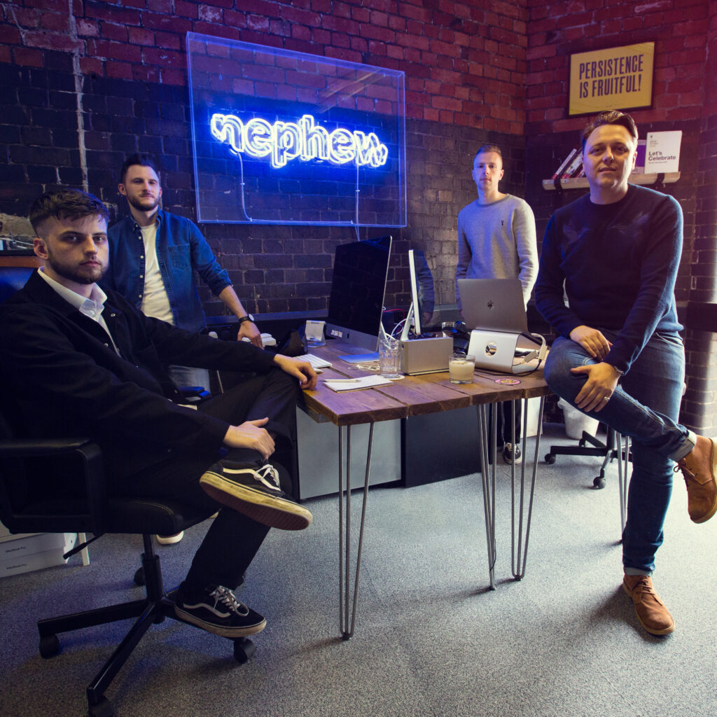
As specialists in branding and digital design, Nephew are used to tackling the complexities of building identities for individuals and organisations in the modern world.
Whether that is for global music icons and big-name brands, or translating the vision of forward-thinking business leaders into cohesive campaigns, the Northampton-based company has been excelling in this space, since 2012.
Yet, the opportunity to support Spautism represented something new, on many levels. While an early involvement in any project is always preferential, this was a brief, with creative freedom, they had been looking for.
“For a few years, we’d been internally discussing partnering up with either a charity or not-for-profit organisation to give something back,” said Ben Morgan, Creative Manager at Nephew.
“We are all sports lovers in the business, predominantly football fans. So naturally, sport is something that we are passionate about, and Spautism is something that we saw potential in.
“Autism is something that generally isn’t properly understood, so we certainly felt we could add some value by helping form a coherent visual identity for Spautism. One that people can get behind and own.”
So how do you take the starting point of a name and a purpose, and make it into something that will resonate with its audience?
“The first thing we’d have is a discovery session, generally a round table discussion with key stakeholders, business owners and the marketing teams,” explained Morgan. “In this case, it was only a small team.”
“We sat down and had some time together to discuss and understand Spautism’s objectives and what we wanted to do from an identity perspective; things that we need to be associated with and things that we need to avoid.
“We then take key insights that we can latch onto from a creative perspective, where we sketch up ideas, concepts and themes that could underpin it. It’s not just, ‘this is a pretty logo’; there’s purpose and a story behind it, so when the identity gets seen in the wider world, it actually makes sense.
“Moodboards articulate, in visual form, what we are thinking, and once approved, we make sure they look good; testing it, ensuring that once these reach a bigger audience, there are no glaring mistakes.
“We apply that process to whatever project it is we are working on.”
“With the ‘i’ within Spautism, positioned at the centre of the word, we have utilised that as a symbol to represent the individual behind it.”
Ben Morgan
Overall, the Spautism proposal took Nephew a couple of months to complete, the average timeframe for a lot of their projects from initial research to the final application.
“To us, we know what Spautism is and what it means, but to somebody new who has not seen it, the first issue is perhaps how you pronounce the word because it’s a marriage between sport and autism. We didn’t want people to mispronounce it and miss the key message, so we tested that right at the beginning with lots of people.
“The story behind it was merging sport and autism together and putting the autistic individual at its heart.
“The ball is synonymous with sport, even if there are some sports that don’t use a ball. Our initial approach was to make sure we have that sporting element within it, because you don’t actually see the word sport, but you say it out loud.
“We also wanted to emphasise within the identity that it is autism and the people behind the autism that matter. With the ‘i’ within Spautism, positioned at the centre of the word, we have utilised that as a symbol to represent the individual behind it.
“There’s a temptation sometimes, with a lot of identities like this, to do something a bit wild. For us, it was about reining it in and getting the simplest version that we could, purely because we wanted Spautism to be approachable and easy for people to understand.”
Having established such integral components to Spautism’s identity, Nephew could imagine and implement other methods to convey the same meanings.
“When you talk about autism, you consider a spectrum. The obvious connotation with spectrum is colour, so it was important to not only get that logic across, but the colours are there to represent any individual in any way they want. It allows for ownership.
“The identity also has to work in a variety of applications, whether that’s through a future association on a team’s jersey or different types of advertising, adding flexibility with the colourisation as well.
“We also wanted vibrancy; we are not talking about dull colours. We wanted this to be an optimistic brand for people to be inspired by.”
Unlike all of Nephew’s other projects in the past, this endeavour straddled a global pandemic and national lockdown with the launch taking place in early April, Autism Awareness Month. It naturally begs the question, did the current climate make creating Spautism’s identity more difficult?
“No, quite the opposite.
“Access to people when making decisions sometimes wasn’t as easy, but being away from your normal space helped with the creative output.
“That’s not to say what we did in our office space was of poorer quality, far from it. It benefitted this project in particular because we were able to come at it from a different angle within a different environment at the time.
“We worked with the Spautism team quite closely, collaborating what was right and what was wrong with a lot of free license to explore different things. Not only was it an enjoyable process, but we got to an end product that we’re proud of and that acts as a platform for Spautism to raise the profile of autism in sport. Ultimately, that’s the objective that the visual identity must achieve.”
With Spautism up and running, Morgan and the team at Nephew still have a few ideas to roll out for the social enterprise in the near future.


